maybe i'm a complete yahoo and this is a more conventional frame but i kinda like it cut this way better-- i like her look more in it.
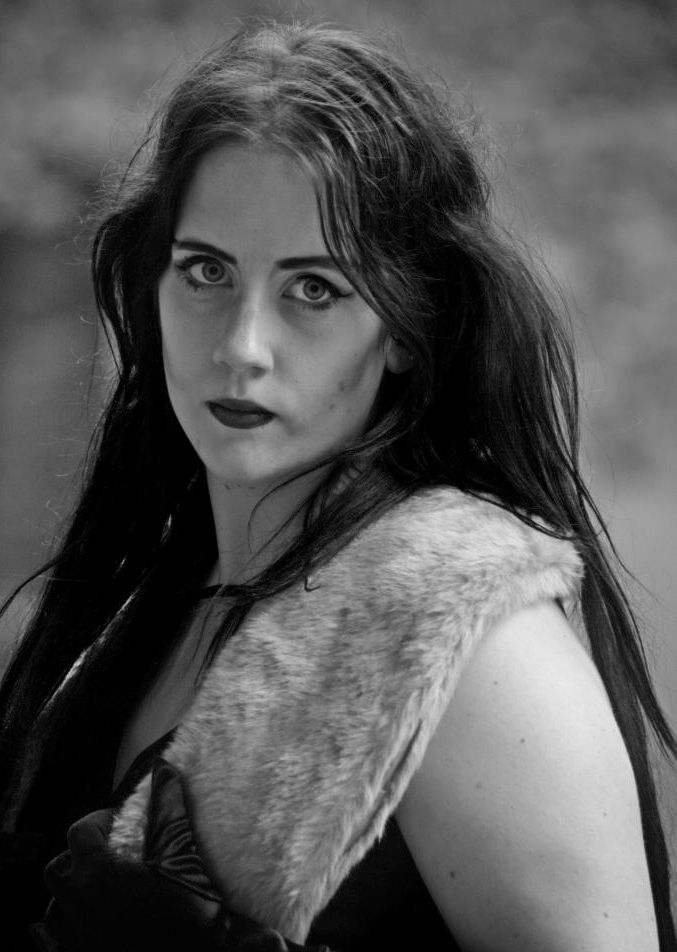
evidently editing the jpg with a primitive tool (osx preview) has altered the contrast of the original which was so awesome to begin with (this one is greyer) but i thought i'd show what i meant.
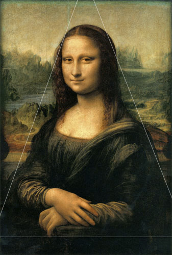
i think by removing the negative space above her 2 things happened: she looks taller/more powerful, and the triangle of the composition fills the frame more.
then again, leonardo gave more head space, but his "lens" is wider, and due to the proportions (more torso, more elbow room) la gioconda's eye line is high on the frame.
anyway since i don't own antagon's photo nor the right to desecrate it i'll nuke it right after though.