I like it. It still doesn't look like most shit out there.
Maybe they're just being hella-ironic. Knowing SY.. |
Okay so I've cracked it... it's been driving me crazy for weeks... I knew that I'd seen the Rather Ripped cover somewhere before... or something similar, it wasn't until I saw the b+w version that it clicked. It is definitely the work of Christopher Wool... I have a catalogue of his collaboration with Harmony Korine called 'Pass The Bitch Chicken' from 2001 (one for HaydenAsche) and look what I found...
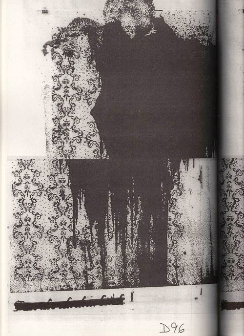 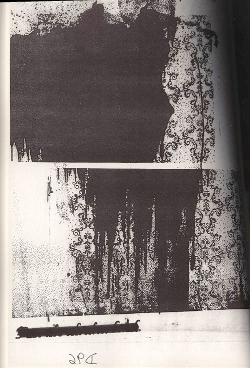 now look at the image from the Kung Fu site. 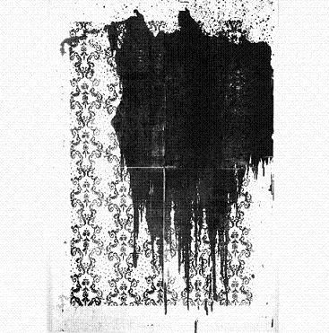 Christopher is mostly known for his large text paintings.  here's a short biography...http://www.ubs.com/4/artcollection/t...phy/index.html So they have kept the grand tradition of working with, or including work of (predominantly East Coast) artists on their album covers alive! Thank Mary-Christ. |
Quote:
nope. like i said in the other thread, it's a referential work just like the other recent covers. it's based on a christopher wool painting. i still don't like the cover at all. |
Quote:
exactly. like i said last week. |
i love the title "rather ripped" and i was hoping for a cover with a little more humour to it.
i think i would like the cover a lot better if it was white and black instead of red and black. |
I like the cover but I don't think it really suits to the album (at least to what I've heard of it, meaning Incinerate, Reena, Do You Believe in Rapture? and live versions of Rats, Turquoise Boy, Sleepin' Around and Lights Out)
|
I noticed that the cover art is not exactly characteristic of Sonic Youth. Seems more like a punk or metal bands kind of cover. But whatever. It's what is inside is what counts the most.
|
fantastic, i stand corrected! my apologies to christopher wool. maybe its because the text is so prominent in the desig, which they dont normally do.
|
Quote:
i still think it's too bad that the designer didn't spend the time cutting out his own fucking stencils instead of just using one of house industries fonts. L-A-Z-Y. |
The covers okay! But i want more traditional Iconic covers from SY like Daydream Nation or Bad Moon Rising. Their music goes from strength to strength, but their covers are fast becoming really lame! I havent liked a SY cover since Dirty (apart from the SYR covers, they are amazing!)
|
Quote:
Washing Machine has a great cover. |
Washing Machine was interesting, but it isnt a iconic cover like Daydream Nation. The image of a candle in a dark corner is so haunting and speaks volumes
|
| All times are GMT -5. The time now is 03:58 PM. |
Powered by vBulletin Version 3.5.4
Copyright ©2000 - 2024, Jelsoft Enterprises Ltd.
All content ©2006 Sonic Youth