I like the "stencils-like" things.
|
not an immediate fan of it if its really the official cover, but maybe it will grow on me...
|
Quote:
open letter to anyone else who thinks i had anything to do with the rather ripped album cover: no fucking way! i hate this cover for a hundred reasons. i just saw it and threw up a little in my mouth. primarily, it's bogus when people fake stencils. it's total fucking lazy bullshit and someone got paid for it... a couple of fucking canned stencil fonts? on a sonic youth record? WHAT THE FUCK!!!!! stencils as a means of print-making are so central to REAL underground culture (politically and culturally) that if yr gonna do it... you'd better fucking **do it** i'd have done it for real. a huge part of my work is stencil based and i often spend days cutting out a single stencil. i also almost always draw my own typefaces whenever they're used on t-shirts or album covers AND ESPECIALLY STENCILS. canned artwork is the death of design. i'm really disappointed that they did that. awful cover and i'm sad that anyone would associate me with it. hater of phoney baloney stencils, chris habib |
i hope the inside artwork makes up for the shitty cover...
...i can't believe they are really using it, it looks very fucking lazy and habib's stencil work is pretty great. check the "post yr art or die" thread to see for yourselves |
whenever i do a referential design, i redraw the whole fucking thing BY HAND and am certain to significantly change the whole context of the thing down to the last detail while adding elements of my own invention.
comme ca the cover for ripped is a referential design that alludes to christopher wool's work. it should have been done properly... |
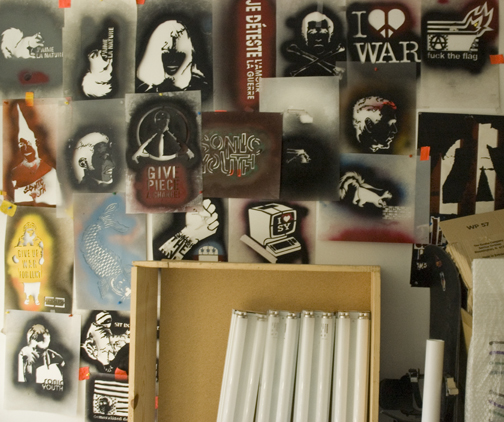 does this look like the wall of someone who would condone such a travesty? i have enough of these to fill all of the walls of my studio... i seriously wish i could muster up a tear. |
I agree with both Chris and AssBlaster. It's pretty half-assed, and the whole industrial style fake stencil font looks like a lame neo-punk band logo. I'm disappointed that SY haven't stuck to the old way of using artists they like to do covers.
EDIT, since Chris and I posted at the same time. Your wall, and work is awesome, top notch, five star stuff. |
Quote:
|
red and black man! The anarchist flag colours!!!!
|
red and black are the nazi party colors
the anarchist flag is all black |
Red and Black are grot topic colors. Fuck Grot Topic.
|
Quote:
didn't you read my post? nazi colors man!! grot topic=nazi |
There just isn't anything to it. I liked the compact one too....ha.
|
come on see the silver album line ing. The pretty intricate patterns like pretty nice. And i guess the black and red are really smbols of "Anarcho-syndicalism"
 |
Quote:
It must be true. |
YOUR nazi comment is like saying the swazstikaa symbol is evol. Which really it is not. there is no such thing as bad cooinsaadince
|
well, i take back the nazi reference, even if i don't understand the "swastika" comment above this.
so are sonic youth on strike or something? or maybe just the graphic designer of rather ripped's cover was on strike? |
every thing happens for a reason. What is the reason "mystical message from the rapture cover"??? I don't know
|
The message is clear: Sonic Youth are satanic nazis.
kungfunation has a different image:  |
Well, so this is the LP cover
Don't know if they're making them different |
| All times are GMT -5. The time now is 08:49 PM. |
Powered by vBulletin Version 3.5.4
Copyright ©2000 - 2026, Jelsoft Enterprises Ltd.
All content ©2006 Sonic Youth